Saturday 28 December 2013

Wastrel #1

I used this one to finally try out my new Andrea Brown set. There are six colors in it; base, three lights and two shadows. The paints have a nice, mat look when applied but mixing them with water can be a bit tricky as they tend to lose their consistency. 
I used dark green for his vest and white with a light wash of brown to keep the color scheme consistent. And I'd known his hair would be red even before I started working on this mini.


The only thing I wasn't really able to get right were his eyes. I tried a few times but for some reason I didn't nail it this time. Maybe it's because his eyes are right below the line of his hat, which makes getting to them with a brush a challenge on its own.
This is the second mini from the Relic Hunters I've painted and I am really impressed with the amount of detail and personality packed into these miniatures. This one looks simply mean and his pose adds to this feel.


The base is a cast from Micro Art Studio. I applied a few layers of green wash to the gutter and added a layer of Vallejo Still water effect after varnishing but unfortunately that's not visible in the pictures.

Thursday 26 December 2013

Sidir Alchibal

I knew I'd be buying this miniature the moment I saw the artwork, regardless of the faction he'd belong to. It turned out he can be used for Guild so I was more than happy to order the Relic Hunter crew. It's been lying at the bottom of my cabinet for a few months but I finally got round to painting them, starting with Sidir.


The first thin you notice when you look at the miniature is that it's much larger than the other ones. He is a monster of a man and is a true giant.
His fluff is interesting, if somehow shadowy. He may have been a prince in the past who was disowned for his crimes. A some point, he run into Lucas McCabe and joined his crew of like-minded characters.


I didn't follow the color scheme from the artwork and chose to paint his sash red instead of blue. I felt that a warmer color would complement the color scheme better. Also, blue would make his skin look pale and I wanted to avoid that as I tried to make his skin look darker.
Painting his robes and turban was a great exercise in using white. I used several layers to make the transitions smooth. I worked with Andrea White Set, which is really great for this color. I also added some dry pigments to the bottom of his robe to make it look as if he had already seen some action. I left the boots unstained on purpose the effect wouldn't show on dark color anyway.
For the base I used Micro Art Studio's cobblestone cast. I got a few for my Relic Hunters and Riflemen.


 photo sidir_01-MOTION_zps0cbadae3.gif

Saturday 21 December 2013

A mad forester

I'd known this would be a hard mini to paint even before I started working on it. I had only the box artwork to follow as a reference for color scheme as there were no good pics of painted minis to be found online. 


Basically, he's a ranger that offers solid help with shooting and has a few traps that cost only a few soulstones. Well. at least that used to be the case with M 1.5 model. To add some twist to the model, Wyrd created this crazy forester dressed up in some rags and wearing a huge bear head trophy as a mask. He offered Guild some much needed shooting from distance and the possibility to ambush your opponent. Another little trick of his was using the cheap clockwork traps and activate them simultaneously to your opponent's models. That way, you could have the upper hand as you'd end up with your important models that haven't been activated yet.


I decided to prepare a tall rock as base for him to go in line with his fluff, I wanted to make him look as if he was scouting the terrain, setting up an ambush. I used bright colors at first and then toned them down with several washes and glazes to get the worn-out, dirty look. I also used dry pigments on the traps to get this rusty look.


I wasn't happy with the fact that all 4 of the traps are identical and decided to make some changes. I cut a little, glued one at a different angle and used some leftovers for Pathfinder's base. Speaking of base, I went for a swampy look. I started by applying a thin layer of Gs. When it dried completely, I continued work with LGS to create some texture. After that, I painted it using a few different shades of green and ended with applying a few layers of Vallejo Still Water. You can see a better pic focusing on the bases below.

Monday 16 December 2013

Old and new - LJ and her crew

The original LJ metal box was one the the main reasons I became interested in Malifaux in the first place. I was blown away when I saw the minis for the first time and the jumping Death Marshal became my favorite instantly. All the miniatures have interesting fluff and are quite unconventional. From a busty sword-wielding blind lady who is called Justice to half-alive, half-dead Death Marshals who use their magically enhanced coffins as weapons. The Judge nicely fit in with his hidden identity theme. Scales of Justice was an addition and unlike the new version, had to be bought separately. Anyway, without further ado, here's my take on the original and the new plastic box.


The new Death Marshals are more dynamic and probably even more over-the-top. While I like the subtle, slightly menacing feel to the old ones, these definitely look good too. The main drawback is the scale issue as the kneeling one is much larger than the other two. That wouldn't be a problem if his gear was the same size but it's bigger too. While the flaming skulls are pretty cool, I really like the grim expressions on the metal DMs.


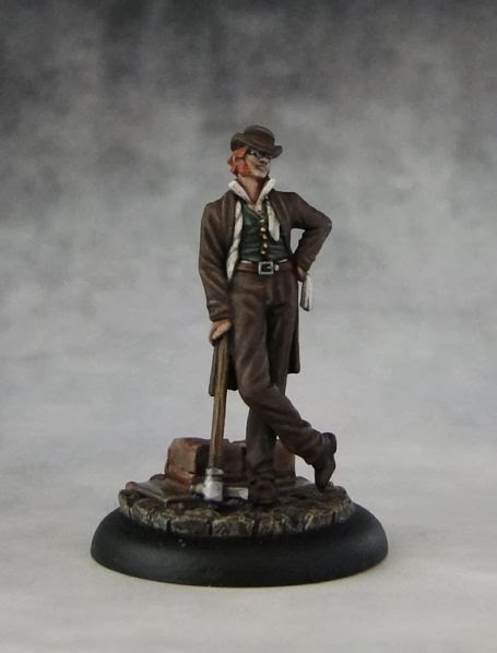
I wrote more about the new Judge yesterday. It's definitely a different take on this character. He looks more mysterious and the addition of hat is a nice touch. The problem is that his glasses (one of his most characteristic features in the original version) are partly hidden beneath it and can't really be seen unless you hold the miniature upside down. The pose of the plastic version is more dynamic, which is nice. The problem, however, is that it's really hard to glue him to the base as his feet are too wide apart. It can be easily fixed with some basework but if you're not into this aspect of the hobby than it might be a serious issue for you.
I couldn't help but point to my favorite version of this mini - the one from Dead Justice set. While it no longer holds the dead/undead? theme, it nicely shows off the zombie in Judge.


The original LJ miniature is awesome with some fantastic details and a nice pose but she was was too large and towered over the rest of her crew. I would normally use the alternative metal version as it fit with the crew much better. The new version is in a very nice dynamic pose, though her hair has caused some controversy. Personally, I don't mind it. The main problem I see with this version is that her sword is glued only in one place where the blade meets the hilt and that simply isn't going to be enough if you plan to use it for gaming and that's the reason why I reinforced it by gluing the blade to her fringe.


In general I like both the old and new versions very much but Scales of Justice is a big improvement in comparison to the metal model. The plastic version looks much more serious, even though it is a bit of an overkill (cross, nails, fire).


So, which version do you like more?

Sunday 15 December 2013

One more Judge

I've finally finished painting the contents of "The Guild Judgement" box. The Judge was the last one I was left with. Similarly to other minis from this box, I used the classic color scheme. I like working with white on clothes, especially when the sculpt has many folds to play with shadows while highlighting. Also, adding the dirt effects using dry pigments is easier with this color.


To keep with the original color scheme, I also painted his bandanna blue. While it plays with the classic idea, now that I look at it, I think red might work better here. Maybe I'll repaint it one day but I guess I'll leave it this way for now.
Placing him on the base was a bit problematic as it was pretty much impossible to keep both of his feet within the base. I ended up using a resin base that has some broken tombstones. While working on this model, I also painted the puppet version.


 I found painting the hair a challenge as there's not much texture there and I needed several highlights to avoid a flat look there. I really like the plastic puppets. All seem to have their own personality and portray the original character with a pinch of salt.
I'll try to write a more detailed comparison of the old and new LJ crews (with pics) tomorrow so stay tuned.

Tuesday 10 December 2013

Dolores Clairbone


I like books that make me think about ideas that I would normally never even consider. In "Dolores Clairbone" the idea is that murder can actually be a good thing (under certain circumstances).
The story is narrated from a first person perspective and it opens with the protagonist's statement. Dolores claims that her confession will be completely true and that whatever she did, she was always thinking about her children first. She is accused of murdering her rich employer, an eccentric lady called Vera Donovan. She looked after her for several years and it seems to have more than a few reasons to kill her. Dolores also states that she did murder her husband but quickly adds that all will be explained in her account of the story.

From there, her tale begins. There are no chapters and the narrative flows smoothly as Dolores tells the story of her life. Dolores is a plain woman so the language is fairly simple but I felt it added depth to the account. Nothing is exaggerated, there are no fancy similes. The story isn't too complicated but it is a good one. As a narrator, Dolores goes into detail when she talks about emotions and these are some of the best elements of her story. Nothing is black or white there, no pure hatred of beautiful love. Shades of grey and pragmatism dominate her account.

The novel offers some interesting insights into family and social relations in the 1950s/60s. The society was patriarchal and the role of man as the main breadwinner was still dominant. As a result, people were willing to turn a blind eye to things like black eye on a woman's face or treated is as a natural consequence of man exercising his rights as the head of the family.
The supernatural element is there but it's not prominent. Actually, it might be one of the few King's novels where there are hardly any supernatural elements to influence the fate of protagonists. The small bits that are there are smoothly interwoven into the narrative and don't influence the plot significantly. It's not a long novel (it is about 300 pages long) but it reads very well. 5-/6

Monday 9 December 2013

Carry your cross

This was the first mini that drew my attention in the new LJ plastic crew. The new totem is a really impressive sculpt with lots of details on it. Actually, I felt that there's even a bit too much of it.

The poor fellow has committed some kind of crime and as a result Lady Justice saw it fit to inflict all kinds of punishment on him. He's carrying a heavy wooden cross, suffers from the oppressive heat of burning embers on metal scales hanging from it, is wounded with large metal nails plunged in several places on his body and last but not least, is forced to wear a metal mask. This definitely sends a strong "don't mess with us" message to Guild's opponents.


As cruel as it is, I find it hard to imagine someone actually being able to withstand such punishment for an extended period of time. The fluff hints that it may actually be a different person in this position each time LJ needs her Totem.

As I mentioned at the beginning, I like the new sculpt. Even though it's slightly over the top with all the painful additions, it still looks much more serious and menacing than the original metal sculpt. I'll definitely have to take a few side by side pictures to compare the original metal version of LJ's crew with the new plastic one. That will have to wait until I've finished painting the Judge, which shouldn't take too long.


Tuesday 3 December 2013

Doctor Sleep


I can't believe it's already been more than a month since I read "Doctor Sleep". Time flies by I guess... Commercially, it was bound to be a success as the novel follows the event presented in "The Shining" - a very popular book that became even more famous after Kubrick's excellent screening with a very memorable part played by Jack Nicholson. King's classic tale of the Overlook hotel, a place filled withe evil presence, is a story of a man's gradual descent into insanity. Jack Torrance is an alcoholic prone to fits of anger and his wife and son are pretty much in constant fear of what this mentally unstable man can do.

The main protagonist of "Doctor Sleep" is Danny Torrance, son of Jack. As a child he used to be a quiet, introverted boy. He also had the special "gift", referred to as shining. He tries very hard not to follow in his father's footsteps but he learns that escaping from your past and striving to be someone else that your father ended up being is not that easy. Similarly to Jack, Dan struggles with problems with alcohol and drugs. He is unable to find a place for himself and wanders without purpose. That is the case until he finds a job in a nursing home, where he can finally put his talent into good use helping the elder patients in their final moments. He becomes known as doctor Sleep. Dan's story is interwoven with that of Abra Stone, a girl who grows up discovering and trying to understand her great talent (shining as well but on a much larger scale). The two protagonists establish a telepathic relationship. We soon learn that Abra is in danger of "The True Knot", a group of ancient vampire-like creatures that feed on the shining. In order to consume it, they kidnap, torture and kill children who possess it.

I think that "Doctor Sleep" is the best King's book about dying since "Insomnia". I really liked the way he described the final moments of patients of the nursing home Dan works in. There's depth and some interesting imagery in these descriptions. These descriptions are quite powerful with all the vivid memories that Dan experiences with his patients but sadness is not a dominant feeling there. I also liked the way King shows how difficult it is to avoid your genetic and mental heritage. The antagonists are also presented in an interesting way. They're not just superhuman beings of unlimited power - they have their own problems, both physical and emotional. It makes them a bit more human but at the same time I never felt that what they do can be justified in any way. Also, Dan Torrent is an interesting character as he often acts in a selfish, sometimes even immoral way but it's not that easy to actually judge him, knowing his past and the way his father traumatized his early years. For me, this moral ambiguity was one of the novel's greatest strengths. Overall, it's a very solid read. You don't need to read "The Shining" to enjoy "Doctor Sleep" but it definitely helps. 4+/6

EDIT: I chose this cover as I like the subtlety in it. It also shows the cat that wasn't perhaps significant for the plot but he had an important function as he would always pay a brief visit to those about to pass away in the nursing home. 
Related Posts Plugin for WordPress, Blogger...