Saturday 31 August 2013

Relic Hunters

I took some time off working on the current Hobbit project (one afternoon to be precise ;) and put together some of Malifaux stuff I bought this summer.
Lucas McCabe and his crew are some of the best looking plastic miniatures I've ever worked with. The wastrels are my big favorites but Sidir is a winner too. I'm only a bit disappointed that Lucas himself seems a bit too large compared to other members of his crew...


While I like the fluff and the looks of Guild riflemen, putting them together was a big pain. There are so many pieces to each of these that even though these bits fit together nicely, gluing them in place was still a challenge. Some of the elements are really tiny and attaching them was really tricky.


These will have to wait for paintjob a while longer as I plan to finish the current Hobbit backlog first.

Friday 30 August 2013

Where Eagles dare

I didn't really expect to enjoy painting these. All those surfaces thickly covered with feathers put me off and made me think that working on these two will be a chore. As it turned out, it was much more enjoyable than I had expected.


The models are nicely cast but putting them together wasn't that easy. The first Great Eagle (pics above) was straightforward as all the pieces fit together well. It was the other one with its wings outstretched that I had trouble with. It seemed like the wings were meant for a different model as I wasn't really able to fit them well. I ended up using a lot of GS to hide nasty gaps left after putting this one together.


 I started painting them with covering all the main areas with a solid basecoat using two different shades of brown and black. I started building the highlights focusing on these three areas and ended with some drybrushing to pick up the details.
Photographing them was a bit tricky as I didn't glue them to their bases (it would make shipping them too risky). I used some blu-tack to hold them in place (you can see some of the putty in one of the pics).
The White Council is next on the to-do list so expect some WIP shots soon. I'll leave you with a classic that seems suitable to this post.


Wednesday 28 August 2013

Heart of Gold

Joyland


Just finished King's latest novel "Joyland". The action takes place in a North Carolina (not Maine ;) amusement park. The story revolves around Devin, a student who takes a part-time summer job in Joyland. As he works there and starts finding out more about the history of the place, it turns out there are some dark secrets in the past.
The plot is rather straightforward but it still kept me interested enough to read the book. What I really liked however, was the description of the carnies and the whole subculture of people working in amusement parks. King uses their own idiolect to a great effect as it helps in identifying with the protagonist who enters this world as a complete outsider. To my mind that is the greatest strength of the book and I can easily recommend it. A short, but good read. 4/6

Monday 26 August 2013

Grim Hammers

Here are a couple more minis I've painted from the Hobbit range. Grim Hammers are an elite dwarven unit and they look... grim. Their expressionless masks and heavy armor with only beards visible create this mean look. The miniatures are really well cast and putting them together was fairly easy, the only small problem being that each of the sets of arms that are available in the box is matched to a particular miniature so it took some time to figure out which goes where.


The dwarf heroes were, as always, a pure joy to paint. However, putting them together was a bit problematic. They're both finecast models so some problems were bound to occur. The main issue I had with Thrain (the one in red armor) was that there was simply no way in which his cape would fit the body. I needed to cut away large part of it and than work a lot with GS to make up for that after it was successfully glued. Thror was pretty much OK except for the sword. When I unpacked the mini the sword was wrapped around his wrist like a snake. It took a lot of time to bend it back to a shape that resembled a sword and even then I was unable to fix it to a perfectly straight position. I gave up after some time as bending it back and forth would result in damage beyond repair.


The main challenge in painting Thrain was that red is a dominant color there. The clothes were easy to work with but painting a red armor was a new experience for me. I followed the codex paintjob, only used slightly darker shades. Also, I managed to paint eyes on him, which are not there in the picture in GW's online store.
While working on Thror's armor, I wanted to try to achieve a result similar to one I got for Jamie Lannister. I used Andrea Gold set and I think it worked well. What I really like about it is the rich, saturated color. Yellow ink is essential to get it. I hardly ever use it but here it really nicely added depth and richness to the armor.

Saturday 24 August 2013

Blaze


I guess I've yet to read a book by Richard Bachman aka Stephen King that I wholly like. I don't want to say that "Blaze" is bad but it just failed to suck me in from the very beginning. 
The story is fairly simple. The main character - Clayton Blaisdell is not a likable person. He's a simpleton and a criminal. Not by choice, he had a difficult childhood and bad company while growing up. 
The narrative is split into two parts, one describing how Blaze tries to snatch a baby from a rich family, the other one giving background on his story from early childhood to adult life. This adds some dynamism but doesn't help in lighting the mood of the novel, which is pretty dark and heavy. I like the way King reflects on society as he shows how an orphanage or a prison system can change a person's character. Blaze is not a reflective type, he takes actions without thinking about consequences and is easily influenced. Because of his mental handicap, it's hard to judge him and describe his as an utterly evil person. The way he uses his simplistic reasoning almost makes one think that some of his actions may be actually justified. I think creating a protagonist like him added a lot of depth to this otherwise fairly shallow novel. So my final verdict is 3-/6 

Wednesday 21 August 2013

Diablo 3: Reaper of Souls

The long awaited expansion to Diablo 3 has finally been released. While the plot seems a bit sloppy (unsuccessfully hiding the black stone... again), the opening cinematics is impressive and the gameplay looks neat too.


Crusader is the new Paladin:


The environment looks a bit darker than in the original game, which is nice. I haven't played D3 for a long time but might just came back to it when RoS is released., though as with any Blizzard game, that will take some time...

Basically... bases

Here's what came in the post yesterday:


I've written about Micro Art Studio before so there's no need for me to shower praise on the quality of their products again. I'll be using them for Malifaux. Lucas and his Relic Hunters will be placed on the cobblestones, new Lady Justice crew will feature cemetery bases and new Ortegas (once they're released) will be put on wasteland bases. I also think I'll get Sonnia's crew when it's released and mystic bases should work well with her.
I used to go with the same style of bases for the whole faction but in the end I decided to use more themed bases as they can nicely emphasize the character of a crew.

Sunday 18 August 2013

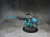
Perdita!

I've had both of these miniatures for more than a year. I bought the avatar version during last year's Gencon and the other one had been bought even before that. For some reason I've been putting off working on them for so long. In general I tend to leave heroes/captains etc. for the end, as a kind of small reward to myself for dealing with a number of similar regular warriors. 
The avatar version was a bit of a challenge to put together. I wasn't sure if the model would stand solidly as the whole beast is attached to the base only in one point (the crystals on the base are part of the original sculpt). Fortunately, it seems strong enough and I didn't have to add additional bits to keep it stable.
I used artwork from the box as reference for color scheme but went for slightly brighter shades. I used VGC Falcon Turquoise as base color and kept adding white to it for successful (numerous) highlights.
I made painting it more challenging by putting the whole miniature together before it was even primed. I should have left Perdita's body for the end as it would have been so much easier to paint it separately. Well, that's just another lesson learnt.


The classic Perdita sculpt is a really nice sculpt. The only thing that I don't really like that much is the length and thickness of hair. I know it's all a fantasy game but having such long hair would be incredibly impractical. Anyway, I actually like this miniature even more than the avatar version. She looks very cool and confident.
I used two halves of a broken column on their bases to somehow tie the models together. Other than that, there's the same type of static grass.


Now my Ortega crew is almost complete. I still have Latigo Pistolleros but I'll be working on them later this year, probably not earlier than in Fall.

Wrath of Kings Kickstarter


It looks like crowdfunding can be a good platform for launching new war games. After successful campaigns of games like Kingdom Death: Monster, Warzone Ressurection and some others, there's another one that's bound for money. Coolminiornot has already funded a few interesting projects via Kickstarter (Rivet Wars, Kaosball, Zombicide), it came back with Wrath of Kings.
It's a fantasy war game set in an interesting universe. Very nice miniatures, some great artwork and a gaming system that looks good too. I'm not going to back this one (I already have too many irons in the fire) but if you're interested, you can check it out here.


Friday 16 August 2013

The big and the ugly

I'm finally done with all the orcs from Hobbit. "Finally" because I felt I was getting in a rut with painting the same type of model. I started with a box of 12 of them on foot, then painted the versions on wargs and finished off with the heroes. 
Azog is a miniature I haven't really made up my mind about yet. The version on warg is very dynamic and everything looks more or less OK on it. I only have to mention that the warg is cast in two halves with separate legs and... the halves didn't fit too well. I had to do the hot water-reshaping-cold water trick to fix that.
The version on foot is ridiculously large. Azog as an infantryman is much bigger than the version on warg and the details look much poorer on this one too, especially areas like legs or armor.
Painting him was tricky as you get white orc on a white warg and I wanted to make sure that the shades of white are distinct enough no to blend together. I started the warg with light brown/khaki basecoat and Azog with Tallarn Flesh and built over than with several layers of base color mixed with increasing amounts of white. Sounds easy but the trick was to avoid a pinkish look and remember about the scars on his chest, arms and back. Pictures don't show the final effect that well ( I really struggled here, for some reason my camera wasn't picking up the colors and highlights on this one) but I'm pretty happy with him nonetheless.


Yazneg has a unique look with his human-like skin and an impressive bone armor. If you look closely, the cloth he's wearing is also something made of a material that resembles human skin (?) and there are even shapes that look like faces in agony around his belt area. He has a really nasty and fierce look with excellent details on the face and clothes. Can't really complain about the miniature here as everything fit pretty well.


As I mentioned in the beginning, painting so many orcs was a bit tedious so I took some time off Hobbit and painted two minis for Malifaux - a master and her avatar version. Check back soon for pics :)


Thursday 15 August 2013

Figure Painter Magazine #4


Just a heads-up that issue 4 is up. For £1.00 you get, in words of authors:

In this huge issue we have not one but two interviews from James Wappel the American painter and successful kickstarter entrepreneur and Justin Gibbs, games developer from Wyrd Miniatures. We also have reviews of Pontosh the Archer, Michael Kontraros Collectibles' Elf dragon Prince, APG's Hessien Jeager & Guild of Harmony's Arielle. There is also four fantastic tutorials that will help painter of every skill level, plus all the regular features including show reports, reader gallery, whats on the market and the best of the latest miniature release's

Wednesday 14 August 2013

What are you doing?


Killing monsters...

The First Law by Joe Abercrombie


Today I've finished reading Joe Abercrombie's trilogy and thought I'd write a few words about it.
I first learnt about it in an article I read somewhere that recommended it as an alternative to "Game of Thrones". There are some similarities; chapters show events taking place in different places and show actions of certain heroes (but unlike in Martin's works they are not presented from different characters' perspectives), motifs of war and invasion of hostile nation, dirty politics, etc. Howerer, Abercrombie's books read differently.
The book uses themes that can easily be associated with any fantasy book. There's an ancient wizard whose goals are mysterious, a veteran warrior whose past is filled with violent exploits, a dandy who irritates everyone but changes over time, a mysterious female warrior, etc. What I really liked was how these were presented in the story. Abercrombie uses these themes, adding unexpected twists and using a very practical, often even ironic approach.
The character that stood out the most to me was Glokta. A kind of anti-hero. A former fencing champion and an accomplished oficer, now a ruin of a man after two years of imprisonment and torture. He is an inquisitor and while doing his job dutifully, he often asks himself a question "Why do I do this?". Chapters that focused on him were my favorites, especially the dialogues. They were really nicely constructed as we could follow both the exchanges between Glokta and his interlocutors and read his thoughts interwoven between these, more than often showing that what he says and does is something completely different than what he thinks. Once again, it's hard to avoid comparing him with Tyrion Lannister from "Game of Thrones" (my favorite character in that series).
I really enjoyed reading these three, probably my first dive into fantasy since I've finished Martin's works. Abercrombie's narrative flows nicely as he describes events both small and great. The protagonists are not necessarily likable but they are quite complex, which makes them even more interesting. Overall, a very good series, I can highly recommend it to everyone who is anxiously waiting for The Winds of Winter and it gets a 4+/6 from me.

Tuesday 13 August 2013

Some more orcs

Four more hunter orcs on wargs. I kept the colors in the same pattern that I had for those painted earlier. Now I need to add some more details to Yazneg and Azog...


Sunday 11 August 2013

Escape from Goblintown showcase #2

I forgot to put these up earlier so here they are now, Thorin's company in full glory and color ;)


Sunday 4 August 2013

It

I thought I'd start a new type of post here. These are not really going to be proper reviews, more like my random thoughts and a way for me to keep track of all the books I either read or listen to in audio version as I paint


Stephen King has been one of my favorites for a while now and much as I love his newer books, I like to return to his older works every now and then. Sometimes it can be disappointing ("Desperation" , "Needful Things") but in most cases it's an interesting journey.
What I see as one of King's greatest strengths as a writer is the ability to accurately portray extreme emotions. He uses various means for that, often choosing unusual imagery. In "It" the protagonists confront evil which often takes physical forms of their greatest fears, such as great bird, evil clown or abusive father. The image of clown is particularly striking.
What I really liked about "It" was how two different stories set apart in time by years. During most of the book we follow the story of a group of children who are described as "Losers". They form a group, set up a club and eventually discover that each of them has seen something unusual or scary and that no one else seems to be noticing these "things". In the end they face the evil and manage to defeat and banish it. 27 years later the children begin disappearing again in the town of Derry and the same group meets again, this time to destroy the evil completely. What makes it harder for then is that they are all suffering from some kind of amnesia and seem to have pushed the memories of their childhood away from their minds. So in order to defeat It, they must first remember what had actually happened when they were children.
The way in which these two stories are interwoven makes following the plot an interesting experience. Another strength of the book is the use of two different ways of perceiving reality - that of children and adults.While the first one may seem to be more naive and superficial, it also has certain merits that become essential in fight against It.
I also liked the way Derry was presented. The whole town was shown both as a place and a symbol in itself. A kind of organic being, deeply corrupted and evil. The same mechanism was used in some of King's other works (such as "Salem's Lot") but here it seemed more convincing.
I'm giving this one a solid 4/6


Saturday 3 August 2013

WIP shots of orc heroes and (another) GW FAIL

I've put together the new Azog miniature along with Yazneg - a character that was respelled by GW shortly after the Hobbit started out as a tabletop game. I guess the designers thought that they need to release a few named orc leaders/heroes to make up for lack of them in the evil forces. Good idea, not only from the marketing perspective but also from a hobbyist one as it gives a chance to work on more nicely designed miniatures.
I didn't really like Yazneg when I saw the codex picture. He seemed way too static and his armor lookes pretty ridiculous to me. I changed my mind after putting him together and mounting him on a larger rocky base with a slightly altered pose. I used a few pieces of cork and plenty of GS to make it look like one big boulder. You can see in the pictures below that the Warg's legs are stretched further than the edge of base so I needed to take that into account while putting the rocky base together.


Azog is a different story. I liked the miniature the moment I saw it, at least the mounted version. I had mixed feelings about the one on foot and still don't feel good about it. You'll notice in the pictures that he's much larger than the version mounted on a Warg, his chest in particular is significantly bigger. I also had some problems putting the large Warg together. The beast is cast in two halves and they didn't fit together well. I needed to put it in hot water, bend it to the proper shape and then out it in cold water to save it in the desired shape. It wasn't too much trouble but it's disappointing that more than two years after the introduction of Finecast (despite an overall improvement in quality) the same problems still make putting these miniatures harder and less enjoyable.


The mounted version of Azog features a base that is larger than a regular cavalry one. It seemed empty when I put the model on it so I added a ruined column. I think it fits the base nicely and it also can also make one think of ruins among which we see Azog in the movie. The foot version is much more static and less interesting. It's also so tall that I decided not to use any additional material on the base as it would make Azog look too tall. 
Related Posts Plugin for WordPress, Blogger...